Top 7 Fonts Used By Professional Graphic Designers
- August 24, 2015
- 0 Comments
- Design, Typography
By Jacob Cass
Source: JUST Creative
Although there have been many other most used font posts, most of them outline fonts used by the ‘not-so-well-trained’ designer. In this post I want to outline the fonts that are often used by the more ‘professional’ of designers.
Top 7 Most Used Fonts Used By Professionals In Graphic Design
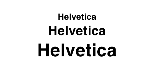
1. Helvetica

Without a doubt, Helvetica is the most heavily used font by professionals (and also by the not so professional) in graphic design. Although some praise the font, many believe that it is spaced too tightly.
And as Vivien pleas in her 16 most overused fonts article,“Understand that you can’t always rely on Helvetica to illustrate and deliver your every message. Helvetica is not perfect for everyone and every occasion.”
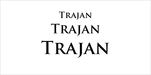
2. Trajan

Trajan finds its way into many Hollywood movie posters and anything remotely to do with religion, law, marriage, class or the past. You can check out the flickr pool for more uses of Trajan.
A bit of history on the font Trajan… Trajan is an old style seriftypeface designed in 1989 by Carol Twombly for Adobe. The design is based on Roman square capitals, as used for the inscription at the base of Trajan’s Column from which the typeface takes its name.
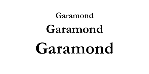
3. Garamond

Although there are many versions of Garamond, the most used version today is the Adobe Garamond version (as seen above) released in 1989. Garamond is a great font for magazines, textbooks, websites and long bodies of text and was recently named the second best font (after Helvetica) by a German publication.
4. Futura

Futura is a font that comes up often in large displays, logos, corporate typefaces and in books where small text is needed. It is based on geometric shapes (near-perfect circles, triangles and squares) which became representative of the Bauhaus design style of 19191933. Futura has an appearance of efficiency and forwardness. Some do hate the font though.
5. Bodoni

Bodoni is a great font for headlines, decorative text and logos. Bodoni has a narrow underlying structure with flat, unbracketed serifs. The face has extreme contrast between thick and thin strokes, and an overall geometric construction which makes it a very aesthetic looking font.
6. Bickham Script Pro

Used mainly for formal occasions, Bickham Script Pro is a font which does the job well… Cameron Moll even recommended it in his article “Typefaces no one will get fired for using.” The ‘not-so-trained’ designer usually vouches for Vivaldi instead which is one of America’s most hated fonts. Another great alternative would beSloop.
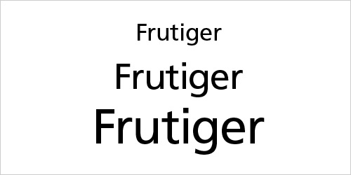
7. Frutiger

The Frutiger font family is neither strictly geometric nor humanistic in construction; its forms are designed so that each individual character is quickly and easily recognised. Such distinctness makes it good forsignage and display work and it is often used in Web 2.0 Logos.
The full family has a warmth and subtlety that have, in recent years, made it popular for the smaller scale of body text in magazines and booklets.
Close Contenders
Here are some other fonts many ‘professional’ designers use quite often; Gills Sans, FF DIN, Franklin Gothic, Bembo, Rockwell, Avenir, Avant Garde, MrsEaves, Gotham, Sabon, Warnock Pro. Notice that none of these are fonts are downloadable for free?


Comments (0)